Introduction
Before you proceed, make sure you’re familiar with the logic of
ggplot, as explained in our introduction to ggplot
tutorial.
We’ll use the diamonds dataset that comes pre-loaded with tidyverse
to demonstrate how to plot relationships between two variables, so let’s
load tidyverse and have a look at the dataset:
# load tidyverse
library(tidyverse)

# add diamonds to the environment
data(diamonds)
Bivariate plots
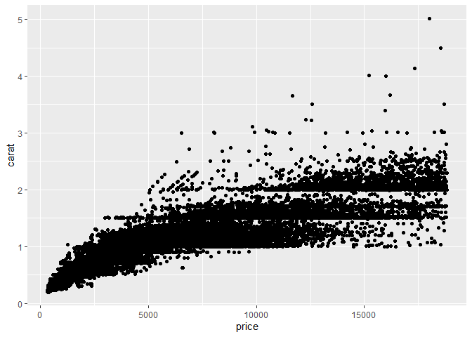
You can plot two continuous variables with a scatter plot. For example, you can plot the relationship between price and carat by specifying these variables as the x and y aesthetics:
# basic scatter plot
ggplot(diamonds, aes(x = price, y = carat)) +
  geom_point()
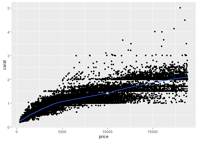
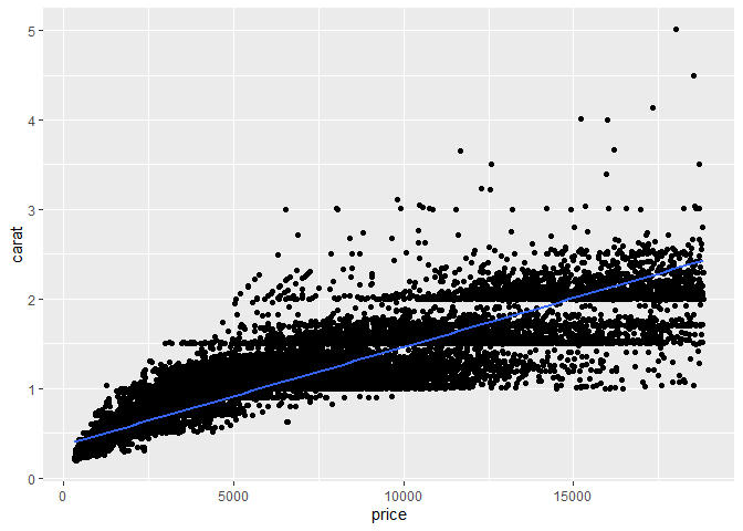
Fitting a smooth curve or a linear regression line to the scatter plot can help you see the overall trend in the data.
# scatter plot with fitted smooth curve
ggplot(diamonds, aes(x = price, y = carat)) +
  geom_point() +
  geom_smooth()
# scatter plot with linear regression line
ggplot(diamonds, aes(x = price, y = carat)) +
  geom_point() +
  # method = "lm" fits a linear model, se = FALSE removes the confidence interval
  geom_smooth(method = "lm", se = FALSE)
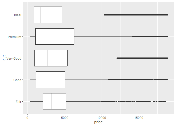
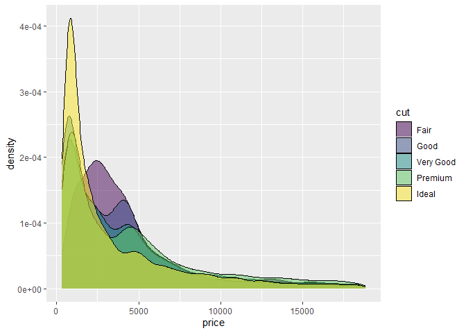
Categorical variables can be used to show the distribution of continuous
variables by group. You can put a categorical variable on one of the
axes, or use it on another aesthetic, such as the fill or color. Note
that if a variable determines the fill, the color, and the shape of the
points, that has to be specified inside an aes() function, while if
the characteristic is pre-defined, then it goes outside the aes()
function. Also note that if you specify aesthetics in the main
ggplot() function, then they apply to all geoms, while if you specify
them in a geom_...() function, they apply only to that geom.
# box plot of price by cut
ggplot(diamonds, aes(x = price, y = cut)) +
  geom_boxplot()
# density plot of price by cut
ggplot(diamonds) +
  geom_density(aes(x = price, fill = cut), alpha = 0.5)
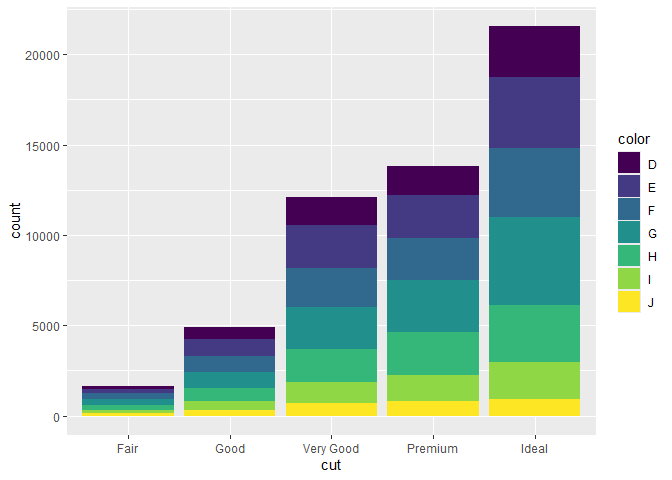
To plot two categorical variables, you can use a bar plot with an extra grouping argument. For example, we can plot the number of diamonds with each combination of cut and color:
ggplot(diamonds, aes(x = cut, fill = color)) +
  geom_bar()
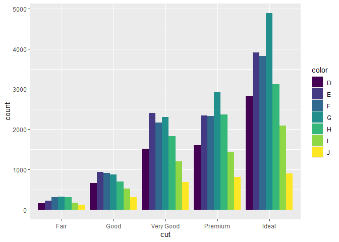
# to put the bars next to each other instead of on top, specify the position
ggplot(diamonds, aes(x = cut, fill = color)) +
  geom_bar(position = "dodge")
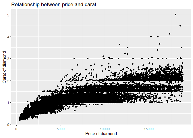
Whenever you make a plot, make sure to use clear labels and titles with
the labs() function to make your visualization easy to understand.
ggplot(diamonds, aes(x = price, y = carat)) +
  geom_point() +
  labs(title = "Relationship between price and carat",
       x = "Price of diamond",
       y = "Carat of diamond")
To learn more about other geoms and customization options, have a look at our advanced visualization tutorial and additional resources.