Introduction
In this workshop, we will expand on some of the basic functions, use tidyverse more and introduce some archaeology specific functions. It will follow the flow of a more typical data analysis workflow. We will again work with data about lithics from the Jerimalai rockshelter in East-Timor. This workshop has been inspired by the ‘tidyverse for archaeologists’ workshop by Professor Ben Marwick.
Some of the code will be evaluated here, but some will not so please copy and paste the code into your own script and run it there.
Load the tidyverse and rio packages.
library(tidyverse)
library(rio)
Data
Remember that the data comes in the form of an excel file from a link,
and that we load it in using the import function from the rio
package.
data <- import("https://bit.ly/j_data_xlsx", setclass = "tbl_df")
Let’s have a more detailed look at the data.
View(data)
summary(data)
This is a lot of information, and not that useful for us, as it is more useful when dealing with true numerical data, something that happens more rarely in archaeological data science than in other disciplines.
Let’s try out some other new functions to look at a data frame that might be more useful in this case.
names(data)
##  [1] "Site"       "Square"     "Spit"       "Group"      "Artno"
##  [6] "Material"   "Colour"     "Weight"     "Length"     "Artclas"
## [11] "Cortex"     "Cortype"    "Initiat"    "Breaks"     "Noseg"
## [16] "Platwid"    "Plat"       "Focal"      "Overhang"   "NoDS"
## [21] "NoPS"       "Rtch"       "Plat_2"     "Focal_2"    "Overhang_2"
## [26] "NoDS_2"     "NoPS_2"     "Rtch_2"     "RetOri"     "Retype"
## [31] "Retloc"     "Retlen"     "Retdep"     "Portion"    "Heat"
## [36] "EdgeDam"    "Weathering" "Corerot"    "RetScNo"    "Term"
## [41] "Janus"      "Recycled"   "Redirect"   "Width"      "Thick"
## [46] "Platthic"   "area"       "elongation"
head(data)
## # A tibble: 6 × 48
##   Site  Square  Spit Group Artno Material Colour   Weight Length Artclas Cortex
##   <chr> <chr>  <dbl> <dbl> <dbl> <chr>    <chr>     <dbl>  <dbl> <chr>    <dbl>
## 1 J     B          1     1     1 Chert    Brown      1.83  22.0  Flake        0
## 2 J     B          1     1     2 Chert    Yellow     0.61  14.6  RetF         0
## 3 J     B          1     1     3 Chert    Dk Grey    3.81  29.6  Core         0
## 4 J     B          1     1     4 Chert    Grey       0.13   5.83 RetFrag      0
## 5 J     B          1     1     5 Chert    Grey       0.05   7.07 Flake        0
## 6 J     B          1     1     6 Chert    Lt Brown   0.58  11.1  Core        NA
## # ℹ 37 more variables: Cortype <chr>, Initiat <chr>, Breaks <chr>, Noseg <dbl>,
## #   Platwid <dbl>, Plat <chr>, Focal <lgl>, Overhang <chr>, NoDS <dbl>,
## #   NoPS <dbl>, Rtch <chr>, Plat_2 <chr>, Focal_2 <lgl>, Overhang_2 <chr>,
## #   NoDS_2 <dbl>, NoPS_2 <dbl>, Rtch_2 <chr>, RetOri <chr>, Retype <chr>,
## #   Retloc <chr>, Retlen <dbl>, Retdep <dbl>, Portion <chr>, Heat <dbl>,
## #   EdgeDam <dbl>, Weathering <dbl>, Corerot <dbl>, RetScNo <dbl>, Term <chr>,
## #   Janus <lgl>, Recycled <lgl>, Redirect <lgl>, Width <dbl>, Thick <dbl>, …
We will select the Square, Spit, Material, Weight, Thick and
Colour columns. Note that we can select multiple columns in one go
using the comma.
data |>
  select(Square, Spit, Material, Weight, Thick, Colour)
Plot 1:
We now want to get into plotting our data. For this we are again only
interested in the Square, Spit, Material, Weight and Thick
columns.
Wile we work with data, we often change our data sets quite a lot depending on what we want to investigate, so it is necessary to cache our data sets under different names. That way we always keep track of which data is stored where, which is particularly important in archaeology given the vastly different types of analysis we can conduct with our data.
data_plotting <- data |>
  select(Square, Spit, Material, Weight, Thick)

print(data_plotting)
## # A tibble: 9,752 × 5
##    Square  Spit Material Weight Thick
##    <chr>  <dbl> <chr>     <dbl> <dbl>
##  1 B          1 Chert      1.83  3.34
##  2 B          1 Chert      0.61  2.74
##  3 B          1 Chert      3.81  7.25
##  4 B          1 Chert      0.13  2.05
##  5 B          1 Chert      0.05  1.13
##  6 B          1 Chert      0.58  4.79
##  7 B          1 Chert      0.03  1.16
##  8 B          1 Chert      0.02  1.09
##  9 B          1 Chert      0.21  3.91
## 10 B          1 Chert      0.25  3.13
## # ℹ 9,742 more rows
We can now create a histogram of the Weight column. This will show how
many artefacts have a certain weight. Creating histograms of a variable
is a common practice in archaeology, as it provides a quick visual
overview of patterns. We can do this using the important ggplot()
function. This function takes a tibble, and can then create all kinds of
plots. ggplot() works with layers.
We can add these layers with a + sign. The base command is ggplot().
This creates a white canvas, and you can add information by adding
layers.
ggplot(data = data_plotting)

Since we have not told ggplot how to display the data yet, we still have a blank canvas.
As we want to make a histogram, we only need to specify the x axis,
which is done by the aes() function within the mapping argument.
ggplot(data = data_plotting, mapping = aes(x = Weight))
We have now filled in the two most important arguments from
ggplot(), data and mapping. Since these arguments are always the
first two arguments in the ggplot() function, we often do not
explicitly name them to save us some time.
However, we still do not see a histogram, so now we need to add a layer that actually tells ggplot that we want the plot to be a histogram.
The layers that define the type of plot are known as geoms(). There
are many different geoms, but we want to create a histogram, so we will
use the geom_histogram() function.
ggplot(data_plotting, aes(x = Weight)) +
  geom_histogram()
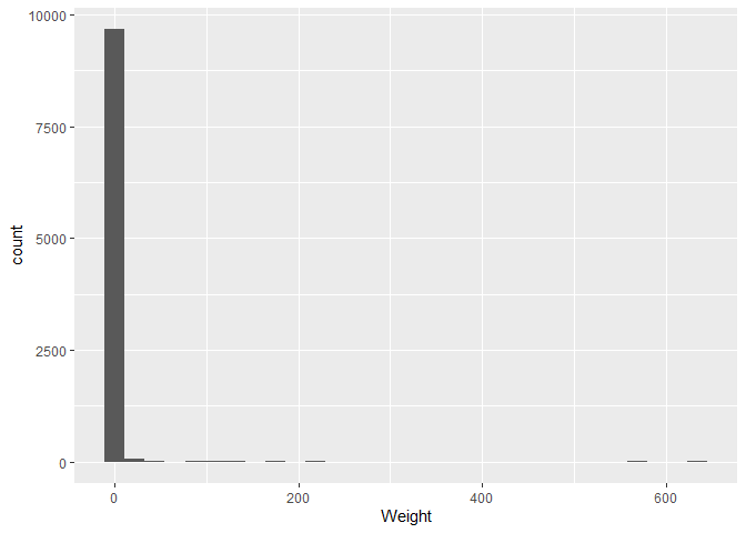
We can see our data on the plot!
However, there appear to be some weights that are very large and cause
the graph to stretch to 600, whilst most are close to zero. If we change
the x-axis scale to a logaritmic scale, we can see the distribution
better. We edit the scale by adding a new layer to our plot, in our case
in the form of the scale_x_log10() function.
A logarithm is a mathematical function that increases slowly at first, and then faster and faster. This is useful for data that has a large range (something you will be encountering more often with archaeological data), as it compresses the data and makes it easier to see the distribution. This specific logarithm is the base 10 logarithm, which means that 10 is raised to the power of the number on the x axis. For example, 10^2 = 100, so the number 2 would be at the position 100 on the x axis.
ggplot(data_plotting, aes(x = Weight)) +
  geom_histogram() +
  scale_x_log10()
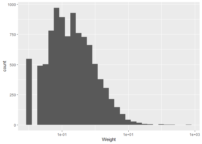
Now that it finally looks like an actual histogram, we can give it a
last touch by changing the theme of the plot. This is purely an optical
change and there are many themes available, but we will just use the
theme_bw() theme for now, which we add like any other layer to our
ggplot().
ggplot(data_plotting, aes(x = Weight)) +
  geom_histogram() +
  scale_x_log10() +
  theme_bw()
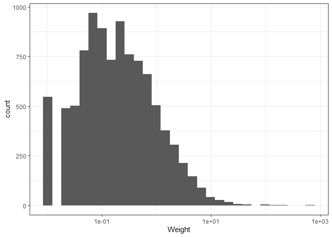
The graph shows us that the majority of findings are very light, yet a few are extremely heavy. This makes sense, considering that we expect the majority of pottery remnants we find to be only shards or smaller objects used in everyday life, with some rarer special items being very heavy.
Plot 2:
for our next plot, we only want to keep rows that have the “A” value for
the Square column. We can do this using the filter() function. Keep
in mind that “A” is a string, so we need to use quotation marks and two
equal signs.
data_plotting_2 <- data |>
  filter(Square == "A")
Now, from these rows we only want light objects, lets say with a
Weight less than 10. We can do this by adding another condition to our
filter() with the & (“and”) operator.
data_plotting_2 |>
  filter(Square == "A" & Weight < 10)
## # A tibble: 4,416 × 48
##    Site  Square  Spit Group Artno Material Colour Weight Length Artclas  Cortex
##    <chr> <chr>  <dbl> <dbl> <dbl> <chr>    <chr>   <dbl>  <dbl> <chr>     <dbl>
##  1 J     A          1    NA  4332 Chert    Peach    1.74  18.3  Flake         0
##  2 J     A          1    NA  4333 Chert    Grey     1.64  20.5  Flake        10
##  3 J     A          1    NA  4334 Obsidian Black    0.12   9.53 Flake         0
##  4 J     A          1    NA  4335 Chert    Grey     2.12  17.6  Flake         0
##  5 J     A          1    NA  4336 Chert    Pink     2.25  19.3  RetF          0
##  6 J     A          1    NA  4337 Chert    Orange   4.88  25.1  Non-diag      0
##  7 J     A          1    NA  4338 Chert    White    8.95  21.0  Flake         0
##  8 J     A          1    NA  4339 Chert    Brown    3.02  20.1  Flake-b       0
##  9 J     A          1    NA  4340 Chert    Grey     2.71  19.5  Flake         0
## 10 J     A          1    NA  4341 Chert    Grey     1.31   9.36 Flake         0
## # ℹ 4,406 more rows
## # ℹ 37 more variables: Cortype <chr>, Initiat <chr>, Breaks <chr>, Noseg <dbl>,
## #   Platwid <dbl>, Plat <chr>, Focal <lgl>, Overhang <chr>, NoDS <dbl>,
## #   NoPS <dbl>, Rtch <chr>, Plat_2 <chr>, Focal_2 <lgl>, Overhang_2 <chr>,
## #   NoDS_2 <dbl>, NoPS_2 <dbl>, Rtch_2 <chr>, RetOri <chr>, Retype <chr>,
## #   Retloc <chr>, Retlen <dbl>, Retdep <dbl>, Portion <chr>, Heat <dbl>,
## #   EdgeDam <dbl>, Weathering <dbl>, Corerot <dbl>, RetScNo <dbl>, …
& is a very useful logical operator. Another very common logical
operator is | (Shift + /), which stands for “or”. If we wanted to
include all observations that have an “A” or “a” value in the Square
column for example, we could write the following code:
data_example_or <- data |>
  filter(Square == "A" | Square == "a")
For now we will continue and add to our previous filters though.
We also want a thickness between 0.2 and 20. We can either do this by
adding two additional conditions, or by using the between() function.
data_plotting_2 |>
  filter(Square == "A" & Weight < 10 & Thick > 0.2 & Thick < 20)
## # A tibble: 4,390 × 48
##    Site  Square  Spit Group Artno Material Colour Weight Length Artclas  Cortex
##    <chr> <chr>  <dbl> <dbl> <dbl> <chr>    <chr>   <dbl>  <dbl> <chr>     <dbl>
##  1 J     A          1    NA  4332 Chert    Peach    1.74  18.3  Flake         0
##  2 J     A          1    NA  4333 Chert    Grey     1.64  20.5  Flake        10
##  3 J     A          1    NA  4334 Obsidian Black    0.12   9.53 Flake         0
##  4 J     A          1    NA  4335 Chert    Grey     2.12  17.6  Flake         0
##  5 J     A          1    NA  4336 Chert    Pink     2.25  19.3  RetF          0
##  6 J     A          1    NA  4337 Chert    Orange   4.88  25.1  Non-diag      0
##  7 J     A          1    NA  4338 Chert    White    8.95  21.0  Flake         0
##  8 J     A          1    NA  4339 Chert    Brown    3.02  20.1  Flake-b       0
##  9 J     A          1    NA  4340 Chert    Grey     2.71  19.5  Flake         0
## 10 J     A          1    NA  4341 Chert    Grey     1.31   9.36 Flake         0
## # ℹ 4,380 more rows
## # ℹ 37 more variables: Cortype <chr>, Initiat <chr>, Breaks <chr>, Noseg <dbl>,
## #   Platwid <dbl>, Plat <chr>, Focal <lgl>, Overhang <chr>, NoDS <dbl>,
## #   NoPS <dbl>, Rtch <chr>, Plat_2 <chr>, Focal_2 <lgl>, Overhang_2 <chr>,
## #   NoDS_2 <dbl>, NoPS_2 <dbl>, Rtch_2 <chr>, RetOri <chr>, Retype <chr>,
## #   Retloc <chr>, Retlen <dbl>, Retdep <dbl>, Portion <chr>, Heat <dbl>,
## #   EdgeDam <dbl>, Weathering <dbl>, Corerot <dbl>, RetScNo <dbl>, …
data_plotting_2 |>
  filter(Square == "A" & Weight < 10 & between(Thick, 0.2, 20))
## # A tibble: 4,392 × 48
##    Site  Square  Spit Group Artno Material Colour Weight Length Artclas  Cortex
##    <chr> <chr>  <dbl> <dbl> <dbl> <chr>    <chr>   <dbl>  <dbl> <chr>     <dbl>
##  1 J     A          1    NA  4332 Chert    Peach    1.74  18.3  Flake         0
##  2 J     A          1    NA  4333 Chert    Grey     1.64  20.5  Flake        10
##  3 J     A          1    NA  4334 Obsidian Black    0.12   9.53 Flake         0
##  4 J     A          1    NA  4335 Chert    Grey     2.12  17.6  Flake         0
##  5 J     A          1    NA  4336 Chert    Pink     2.25  19.3  RetF          0
##  6 J     A          1    NA  4337 Chert    Orange   4.88  25.1  Non-diag      0
##  7 J     A          1    NA  4338 Chert    White    8.95  21.0  Flake         0
##  8 J     A          1    NA  4339 Chert    Brown    3.02  20.1  Flake-b       0
##  9 J     A          1    NA  4340 Chert    Grey     2.71  19.5  Flake         0
## 10 J     A          1    NA  4341 Chert    Grey     1.31   9.36 Flake         0
## # ℹ 4,382 more rows
## # ℹ 37 more variables: Cortype <chr>, Initiat <chr>, Breaks <chr>, Noseg <dbl>,
## #   Platwid <dbl>, Plat <chr>, Focal <lgl>, Overhang <chr>, NoDS <dbl>,
## #   NoPS <dbl>, Rtch <chr>, Plat_2 <chr>, Focal_2 <lgl>, Overhang_2 <chr>,
## #   NoDS_2 <dbl>, NoPS_2 <dbl>, Rtch_2 <chr>, RetOri <chr>, Retype <chr>,
## #   Retloc <chr>, Retlen <dbl>, Retdep <dbl>, Portion <chr>, Heat <dbl>,
## #   EdgeDam <dbl>, Weathering <dbl>, Corerot <dbl>, RetScNo <dbl>, …
We also don’t want rows that have NA values in the Material column.
data_plotting_2 <- data_plotting_2|>
  filter(Square == "A" & Weight < 10 & between(Thick, 0.2, 20) & !is.na(Material))
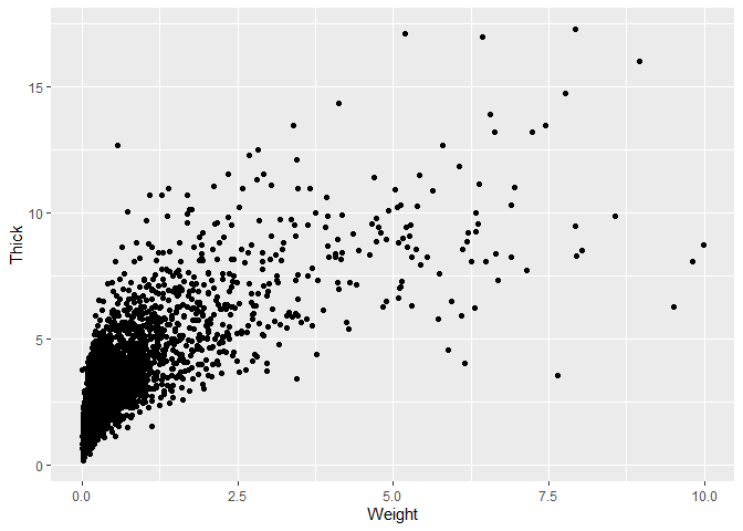
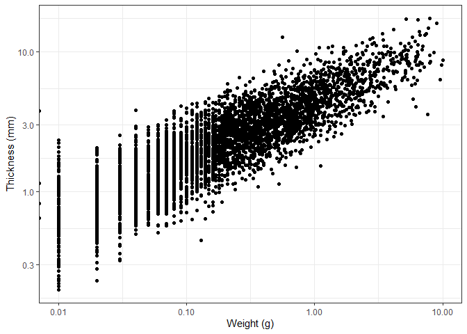
We now want to create a scatterplot of the Weight and Thick columns.
Scatterplots can be used in archaeology to examine correlations between
two variable of an object, for example the depth from which it was
excavated and the time it can be dated to. In that sense it also allows
us to visually find outliers that might infer an unusual activity or
previously unexplained pattern.
Create the empty plot, now define both x and y.
ggplot(data_plotting_2, aes(x = Weight, y = Thick))
Add the geom_point() layer that creates a scatterplot.
 ggplot(data_plotting_2, aes(x = Weight, y = Thick)) +
  geom_point()
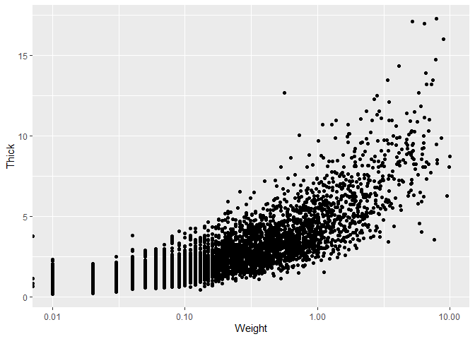
It may again be useful to change the x axis to a logarithmic scale.
 ggplot(data_plotting_2, aes(x = Weight, y = Thick)) +
  geom_point() +
  scale_x_log10()
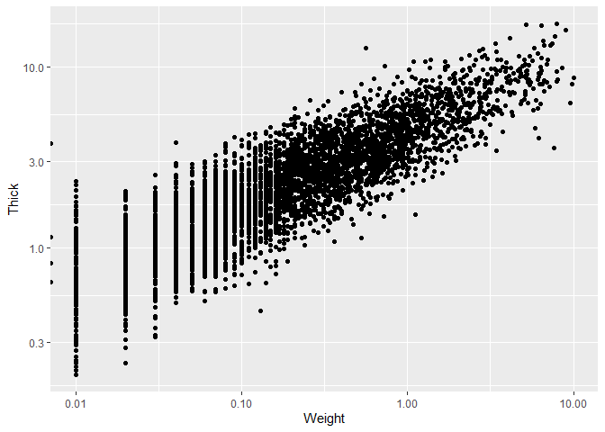
We can also do the same for the y axis this time.
 ggplot(data_plotting_2, aes(x = Weight, y = Thick)) +
  geom_point() +
  scale_x_log10() +
  scale_y_log10()
We now set the theme, as well as changing the axis labels, for which we
use the labs() function that has all types of useful arguments to
change the labels of our plots.
 ggplot(data_plotting_2, aes(x = Weight, y = Thick)) +
  geom_point() +
  scale_x_log10() +
  scale_y_log10() +
  theme_bw() +
  labs(x = "Weight (g)", y = "Thickness (mm)")
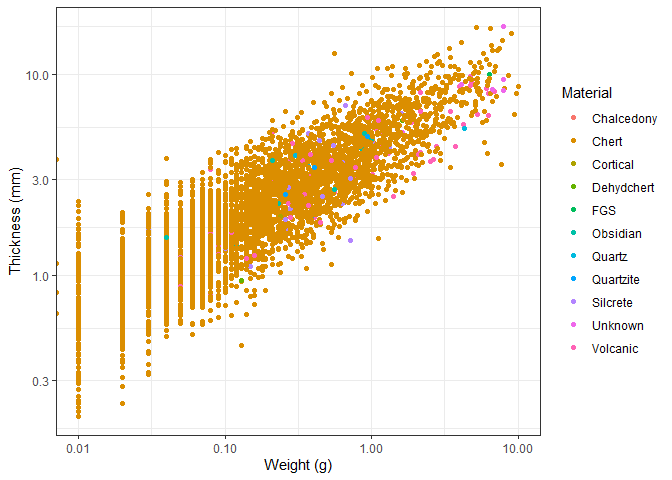
We can also add a colour to the points based on the material the object
is made of. We do this by adding the colour argument to the aes()
function and telling it to base the color on the Material column.
 ggplot(data_plotting_2, aes(x = Weight, y = Thick, colour = Material)) +
  geom_point() +
  scale_x_log10() +
  scale_y_log10() +
  theme_bw() +
  labs(x = "Weight (g)", y = "Thickness (mm)")
Using the theme() function (not to be mixed up with the different
themes functions), we can change the position of the legend. We need
to specify the x and y coordinates of the legend. This uses a coordinate
system between 0 and 1, so 0.5 is in the middle. When you create your
own graphs, finding the right position might take some try and error.
ggplot(data_plotting_2, aes(x = Weight, y = Thick, colour = Material)) +
  geom_point() +
  scale_x_log10() +
  scale_y_log10() +
  theme_bw() +
  labs(x = "Weight (g)", y = "Thickness (mm)") +
  theme(legend.position = c(0.85, 0.3))
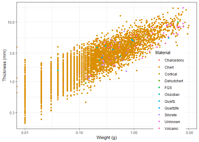
Examining this graph, we observe a clear relationship between an object’s thickness and its weight. While this relationship is intuitive, it is important to note that both axes have been transformed using a logarithmic scale. A closer inspection reveals that as thickness increases, weight increases at a slightly greater rate. This aligns with expectations, as volume—which is related to weight—scales non-linearly with an object’s dimensions, including thickness in this case.
Apart from that, the colors allow us to see that the most common material used is by far chert. This is in line with our expectations, as chert is and was widely available, easily worked with and very durable.
Plot 3:
Our goal now is to make a boxplot of a plat_area column, grouped by
the Material column. Boxplots are useful to use in archaeology to
estimate size distributions by a category like we are doing it here.
Lets get the data first. We need to create the plat_area column first.
data_plat_area <- data |>
  mutate(plat_area = Platwid * Platthic)
Now we only keep materials that have more than 5 objects and remove NA
values. To create subgroups within a data frame use the group_by()
function that requires a column as input based on which groups will be
created.
data_plotting_3 <- data_plat_area |>
  group_by(Material) |>
  filter(n() > 5 & !is.na(Material))
Now create the plot using the geom_boxplot() function. We leave the
code for a homework assignment.
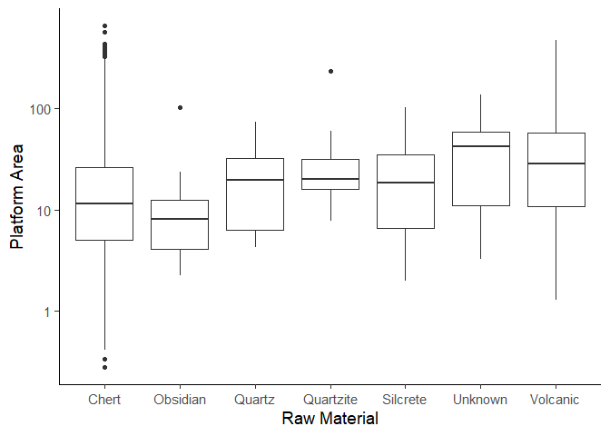
This graph shows us that some materials, such as chert and volcanic, show a wider range of platform areas, suggesting they were worked in diverse ways. Obsidian on the other hand has a relatively small range, likely due to its brittle nature and conchoidal fracture properties. At the same time, the clustering of platform sizes for materials like obsidian or quartz suggests these materials might have been processed in a relatively standardized way.
Additionally, the presence of outliers hints at the fact that there might be some exceptionally large (small) pieces. This observation goes hand in hand with our earlier observation that there were some extremely heavy findings.
Plot 4:
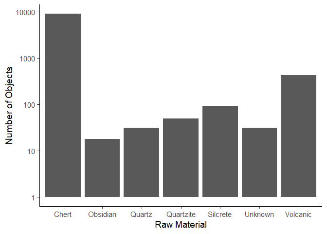
We now want to create a plot that shows the number of objects per material. First get the data.
To get the number of objects we make use of the count() function. The
count function counts the number of unique values in a column and
returns a summary table with the values and their counts.
data_plotting_4 <- data_plotting_3 |>
  group_by(Material) |>
  count()
Now create the plot using the geom_col() function.
ggplot(data = data_plotting_4) +
  aes(x = Material,
      y = n) +
  geom_col() +
  scale_y_log10() +
  labs(x = "Raw Material",
       y =  "Number of Objects") +
  theme_classic(base_size = 14)
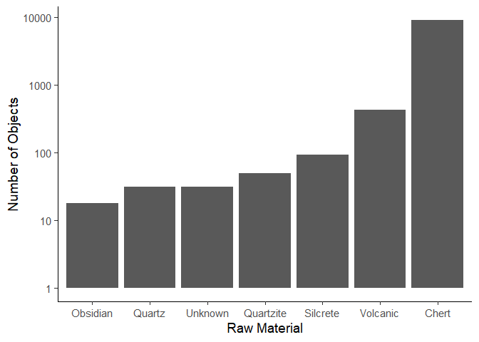
We can change the order of the columns using the reorder() function.
We need to specify the column we want to reorder, and the column we want
to order by. In this case, we want to order the Material column by the
n column to order the columns by height.
ggplot(data = data_plotting_4) +
  aes(x = reorder(Material, n),
      y = n) +
  geom_col() +
  scale_y_log10() +
  labs(x = "Raw Material",
       y =  "Number of Objects") +
  theme_classic(base_size = 14)
If we wanted to create a top 5 plot, we would first arrange the data by
the n column, and then only keep the top 5 rows. Here we make use of
the arrange() function which can rearrange columns. By default,
arrange() orders in ascending order, so if we want to arrange in
descending order, we have to add the desc() function in the
arrange() function.
data_plotting_4 <- data_plotting_4 |>
  arrange(desc(n)) |>
  head(5)

ggplot(data = data_plotting_4,
       aes(x = reorder(Material, n), y = n)
       ) +
  geom_col() +
  scale_y_log10() +
  labs(x = "Raw Material", y = "Number of Objects") +
  theme_classic(base_size = 14)
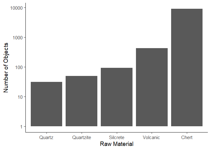
Similarly to our previous plot, we can see the popularity of chert as a material due to its availability, how easy it is to work with, its properties and the fact that it is quite durable, withstanding the test of time better than other materials. Volcanic objects are the second most popular, which could be due to their useful fracturing properties giving them very sharp edges that were commonly used. Quartz, quartzite and silcrete show a progressively lower count, which could be due to availability, manufacturing difficulties, or cultural preferences.
Plot 5:
Now lets say we want to make a plot of the distributions of length of
each object. We can either manually create each plot by filtering for
each material, or we can simply use the facet_wrap() function that
splits a plot up by a column.
ggplot(data = data_plotting_3) +
  aes(x = Length) +
  geom_histogram() +
  facet_wrap(~Material) +
  labs(x = "Length (mm)",
       y =  "Number of Objects") +
  theme_classic(base_size = 14)
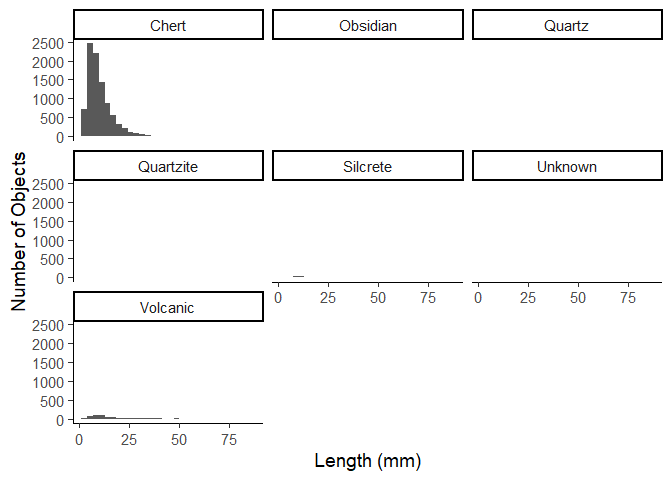
Due to the amount of chert items in the data, this is not very useful,
but with the scales argument we can set the y axis to be free for
each plot.
ggplot(data = data_plotting_3) +
  aes(x = Length) +
  geom_histogram() +
  facet_wrap(~Material, scales = "free_y") +
  labs(x = "Length (mm)",
       y =  "Number of Objects") +
  theme_classic(base_size = 14)
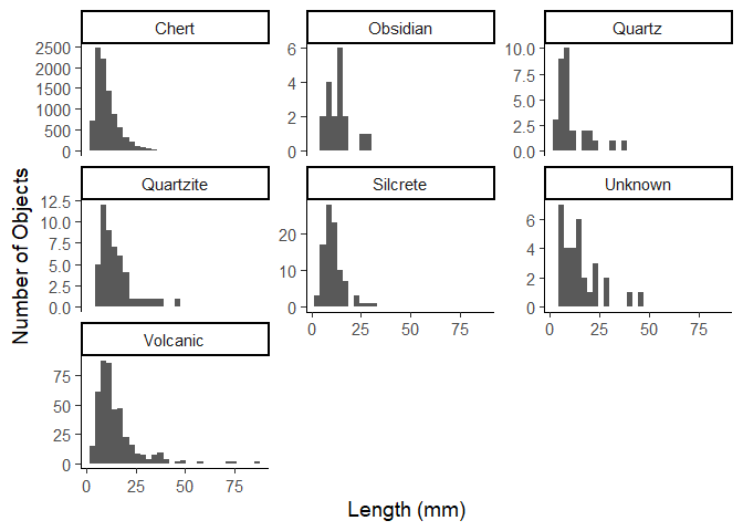
In this graph, chert dominates once again in terms of quantity. However, most chert artifacts are small (under 25 mm), suggesting intensive reduction sequences or the frequent production of small tools or flakes. This distribution between smaller and larger object appears to be common as we would expect at this point, with larger objects being rarer.
Only volcanic and unknown materials appear to have a few more objects above 25mm in length, at least in comparison to the other materials.
Homework assignments
For all assignments, consider how your findings allow you to infer relevant archaeological conclusions from the data.
Assignment 1
Create the plot below. This is the same plot as we made earlier in the workshop.

Assignment 2
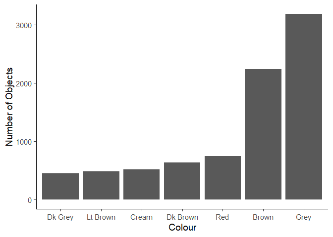
Create the plot below of the most common colors. You will need to perform some data manipulation first.
Assignment 3
What is the most common term in the dataset? Create a tibble that
contains the term (use the variable Term) and the number of times it
occurs.