Schedule:
- day 1: finish coordinate systems, maybe start with facets
- day 2: (facets), patchwork, theme, other packages
Introduction
This tutorial introduces data visualization in R, primarily using the
ggplot2 package (included in tidyverse). The tutorial is based on
A ggplot2 Tutorial for Beautiful Plotting in
R
by Cédric Scherer and Modern Data Visualization with
R by Robert Kabacoff.
Visualization with ggplot2
Packages and data
You will use the following packages and dataset to practice data visualization. The data contains information about Chicago’s weather on a daily basis between 1997–2000.
library(tidyverse)
library(patchwork) # multiple plots
library(GGally) # correlation scatterplot matrix
library(scatterplot3d) # 3-D scatterplots
library(ggalluvial) # static alluvial diagram
library(networkD3) # interactive alluvial diagram
library(plotly) # interactive plots

# Load the data from GitHub
chic <- read_csv("https://raw.githubusercontent.com/ucrdatacenter/projects/main/apprenticeship/2024h1/3_visualization/chicago.csv")
Basic plots
The ggplot2 package builds up figures in layers, by adding elements
one at a time. You always start with a base ggplot where you specify
the data used by the plot and possibly the variables to place on each
axis. These variables are specified within an aes() function, which
stands for aesthetics.
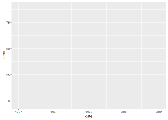
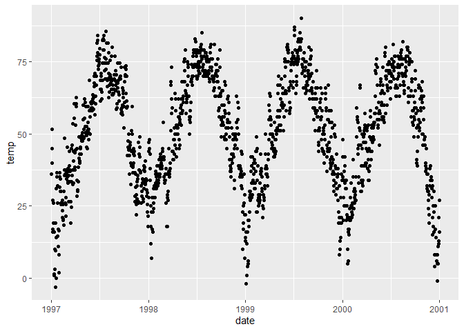
The ggplot() function in itself only creates a blank canvas; we need
to add so-called geoms to actually plot the data. You can choose from a
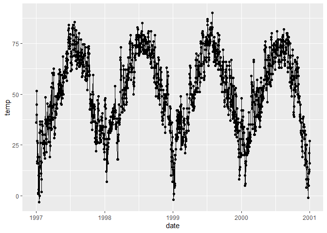
wide range of geoms, and also use multiple geoms in one plot. You can
add elements to a ggplot objects with the + sign. You should think
of the + sign in ggplot workflows in the same way you think of the
pipe operators in data wrangling workflows.
# Create the base of a plot with date on the x-axis and temperature on the y-axis
ggplot(chic, aes(x = date, y = temp))
# Create a scatterplot
ggplot(chic, aes(x = date, y = temp)) +
  geom_point()
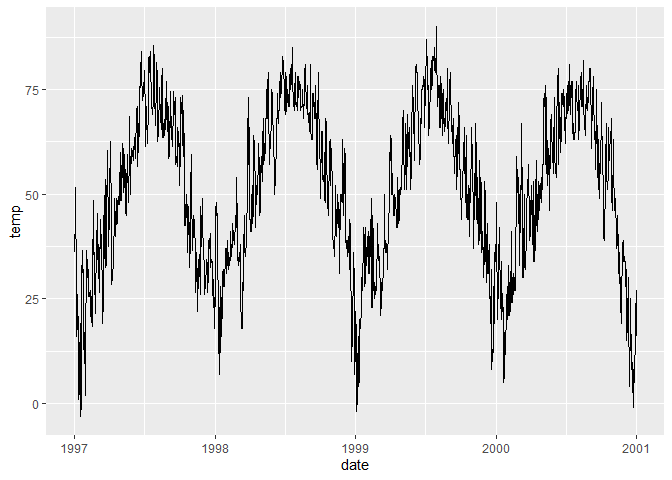
# Create a line plot
ggplot(chic, aes(x = date, y = temp)) +
  geom_line()
# Combine both points and lines in the plot
ggplot(chic, aes(x = date, y = temp)) +
  geom_point() +
  geom_line()
# Customize the appearance of points and lines
ggplot(chic, aes(x = date, y = temp)) +
  geom_point(color = "firebrick", shape = "diamond", size = 2) +
  geom_line(color = "firebrick", linetype = "dotted", size = .3) +
  theme_light() # Apply a light theme
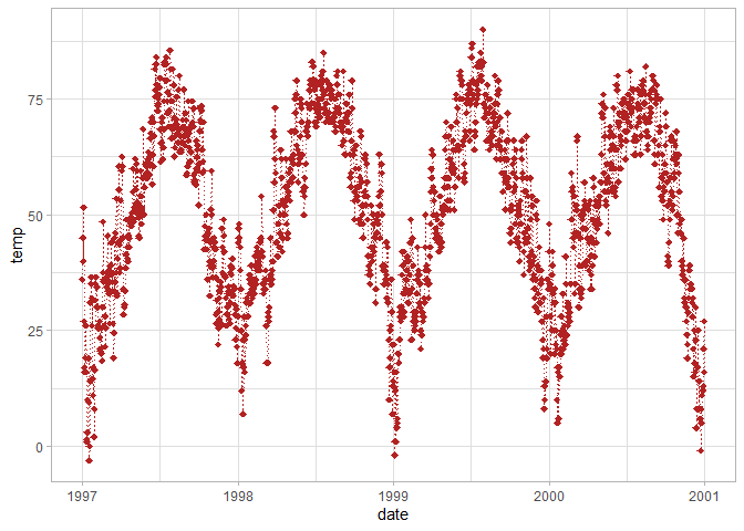
The previous example used the theme_light() function to change the
design of the plot. Instead of specifying it per individual plot, you
can change the default setting for all future plots with the
theme_set() function.
# Set the default theme for all following plots
theme_set(theme_light())
There are multiple ways to make axis titles more informative, such as
the xlab() and ylab() functions or the x and y arguments in the
labs() function. These elements can be added to a ggplot object just
like any geom, theme, or other customization option.
# Add axis labels with xlab() and ylab()
ggplot(chic, aes(x = date, y = temp)) +
  geom_point(color = "firebrick") +
  xlab("Year") +
  ylab("Temperature")

# Add axis labels with labs(), use math expressions
ggplot(chic, aes(x = date, y = temp)) +
  geom_point(color = "firebrick") +
  labs(x = "Year", y = expression(paste("Temperature (", degree ~ F, ")")))

Additional aesthetics and legends
In addition to using the x and y axes to show variable values, you can
use other characteristics of geoms to vary based on variables. You can
add these additional characteristics – such as color, fill, size, shape
– to the aes() function.
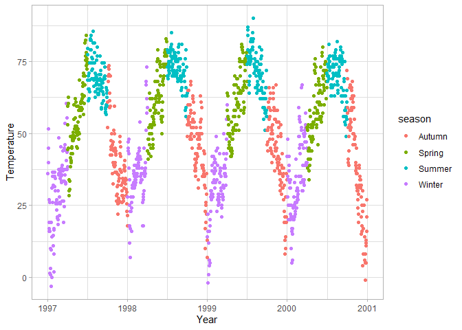
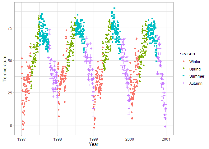
Notice that R treats characters as factors, and arranges them in alphabetical order. If you would like to change this default behavior because the variable has another meaningful order (e.g. for seasons Spring should come after Winter), you can convert the variable to a factor with the levels defined in the correct order. The code below is also an example of how you can transition from a pipe workflow of data wrangling to immediately visualizing the data without needing to save the intermediate dataset as a separate object.
# Color the scatterplot points by season
ggplot(chic, aes(x = date, y = temp, color = season)) +
  geom_point() +
  labs(x = "Year", y = "Temperature")
chic |>
  # Convert season to a factor with seasons in the correct order
  mutate(season = factor(season, levels = c("Winter", "Spring", "Summer", "Autumn"))) |>
  # Determine the color and shape of the points by season
  ggplot(aes(x = date, y = temp, color = season, shape = season)) +
  geom_point() +
  labs(x = "Year", y = "Temperature")
If a step of data wrangling should apply to all plots, it is easier to save the resulting data as a new object or overwrite the original data (if it doesn’t lead to a loss of information).
# Convert season to a factor in the original data
chic <- chic |>
  mutate(season = factor(season, levels = c("Winter", "Spring", "Summer", "Autumn")))
Other geoms
So far you have seen point and line geoms, but there are many more. The R Graph Gallery provides a long list of common plot types, and so do Chapters 4 and 5 of Modern Data Visualization with R. Both resources group geoms by the type of variable(s) plotted.
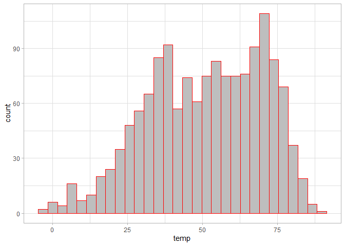
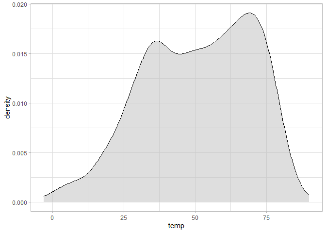
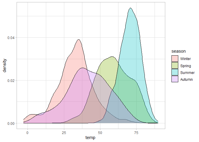
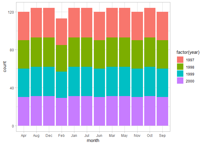
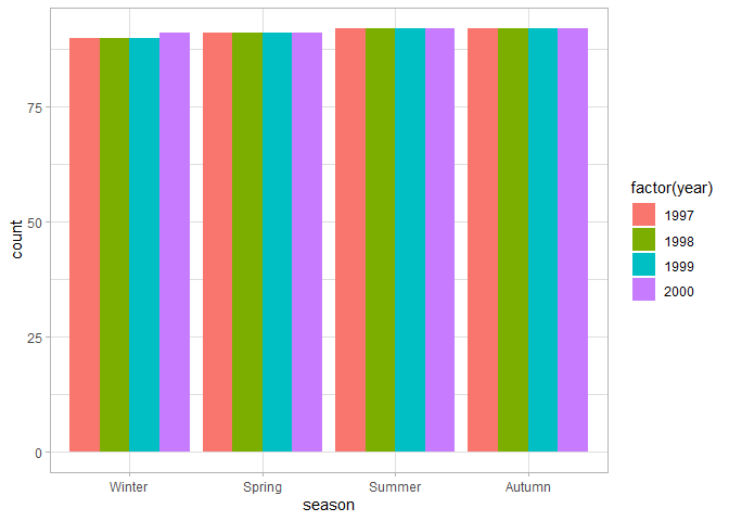
For the frequency distribution of a continuous variable, you’d often use a histogram or density plot, while for the frequencies of a categorical variable you’d use a bar chart.
# Histogram of temperatures
ggplot(chic, aes(temp)) +
  geom_histogram(fill = "grey", color = "red")
# Density plot of temperatures
ggplot(chic, aes(temp)) +
  geom_density(fill = "grey", alpha = 0.5)
# Density plot of temperatures per season
ggplot(chic, aes(temp, fill = season)) +
  geom_density(alpha = 0.3)
# Number of observations per month
ggplot(chic, aes(month)) +
  geom_bar()

# Number of observations per month, colors by year
ggplot(chic, aes(month, fill = factor(year))) +
  geom_bar()
# Number of observations per month, colors by year
ggplot(chic, aes(season, fill = factor(year))) +
  geom_bar(position = "dodge")
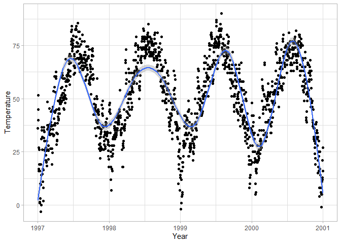
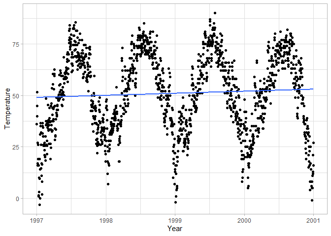
 To
make relationships between two continuous variables clearer, you can add
smoothing curves – you can keep the curve flexible or restrict it to a
straight line.
# Add a smooth curve to the scatterplot
ggplot(chic, aes(date, temp)) +
  geom_point() +
  geom_smooth() +
  labs(x = "Year", y = "Temperature")
# Use a linear fit and remove confidence interval around the line
ggplot(chic, aes(date, temp)) +
  geom_point() +
  geom_smooth(method = "lm", se = FALSE) +
  labs(x = "Year", y = "Temperature")
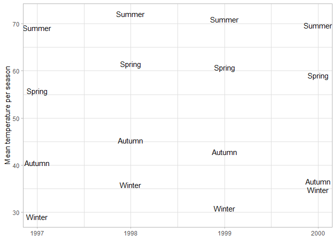
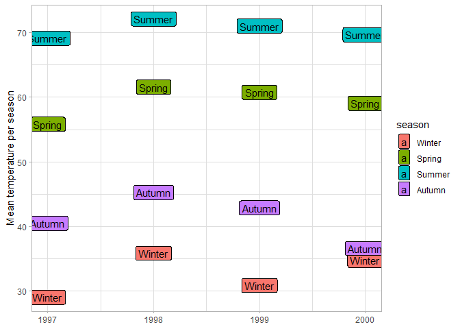
You can use text as geoms as well, either on top of other geoms to label them, or as the main data markers. In this case the y-coordinates of the labels correspond to the average temperature of the season.
# Plot the mean temperature per season
chic |>
  # Calculate mean temperature per year and season
  group_by(year, season) |>
  summarize(temp = mean(temp)) |>
  ggplot(aes(year, temp)) +
  geom_text(aes(label = season)) +
  labs(x = NULL, y = "Mean temperature per season")
# geom_label is the same as geom_text but with a filled background
chic |>
  group_by(year, season) |>
  summarize(temp = mean(temp)) |>
  ggplot(aes(year, temp)) +
  # Fill label background per season
  geom_label(aes(label = season, fill = season)) +
  labs(x = NULL, y = "Mean temperature per season")
You can use various other geoms to highlight particular points or
boundaries of your plot, e.g. by adding horizontal or vertical lines at
key locations. An easy way to highlight particular observations is to
add a new layer of geoms, where instead of the full dataset you use a
filtered version with only the highlighted observations. In that case
you can override the global data choice in ggplot() by adding a data
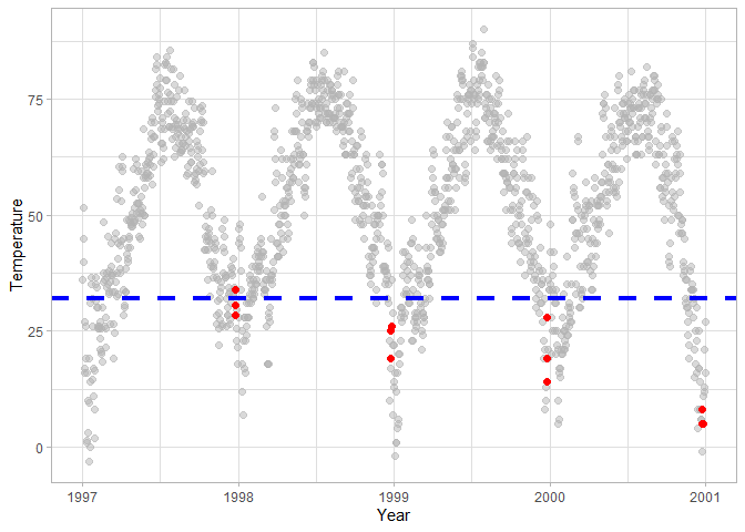
argument within a geom. In this case chic |> filter(yday %in% 358:360)
keeps the Chistmas period in all years, and highlights them in red. The
dashed blue line at 32F temperature (0 Celsius) makes it easy to
determine whether a particular year had below-freezing temperatures on
Christmas.
ggplot(chic, aes(date, temp)) +
  geom_point(color = "grey70", alpha = 0.5, size = 2) +
  # Highlight selected points: Christmas from each year
  geom_point(data = chic |> filter(yday %in% 358:360), color = "red", size = 2) +
  # Add a horizontal line at temp == 32
  geom_hline(yintercept = 32, color = "blue", linetype = "dashed", size = 1.5) +
  labs(x = "Year", y = "Temperature")
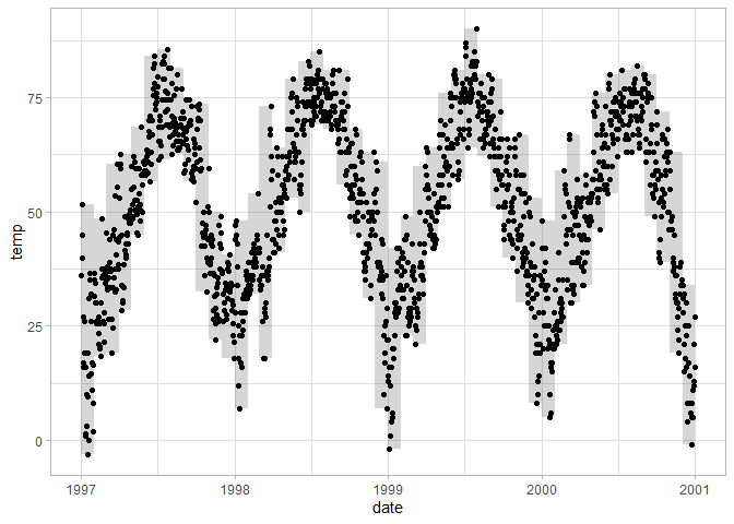
If you’d like to plot intervals, ribbon geoms may be useful. For each x (y) value the ribbon needs a minimum and maximum point along the y (x) axis. In this case the monthly minimum and maximum temperatures form the lower and upper bounds of the ribbon. It can also be used to plot confidence intervals or standard errors around estimated values.
# Add a ribbon showing monthly range of temperatures
chic |>
  # Calculate lowest and highest temperature per month
  group_by(year, month) |>
  mutate(upper = max(temp),
         lower = min(temp)) |>
  ggplot() +
  # use those temperatures as upper and lower bound of a ribbon
  geom_ribbon(aes(x = date, ymin = lower, ymax = upper), alpha = 0.2) +
  geom_point(aes(date, temp))
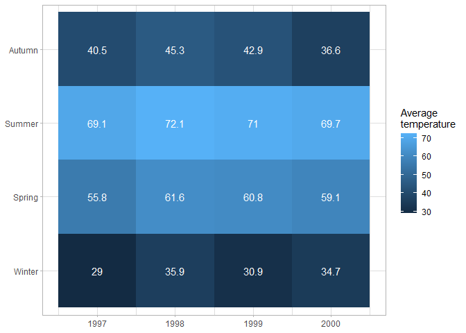
Heatmaps have a variety of uses; they are most commonly used to show correlations between predictors, but they can have any two categorical variables on the axes, and use color to show how the value of a (usually continuous) variable differs between different combinations of the categorical variables. For example this figure shows how average temperature changes in different years and seasons.
# Heatmap of average temperature per season
chic |>
  # Calculate average temperature per season
  group_by(year, season) |>
  summarize(temp = mean(temp)) |>
  ggplot() +
  # geom_tile with fill aesthetic creates heatmap
  geom_tile(aes(year, season, fill = temp)) +
  # Add text to display average temperatures
  geom_text(aes(year, season, label = round(temp, 1)), color = "white") +
  labs(x = NULL, y = NULL, fill = "Average\ntemperature")
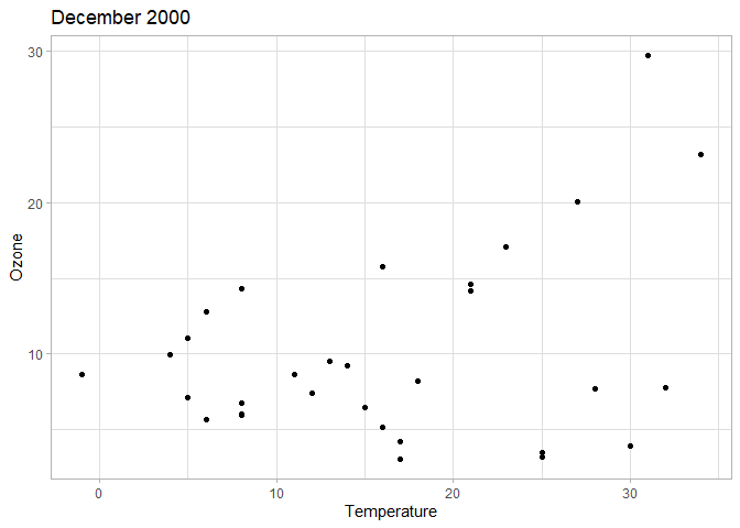
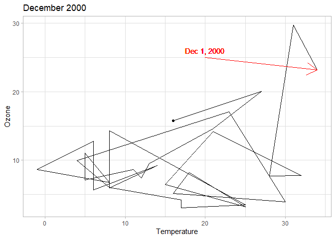
To show how relationships evole over time, you can use geom_path that
connects observations based on their ordering in the original dataframe
(so make sure that your data is properly sorted, otherwise you’ll end up
with nonsense results). If you have may observations, paths can look
very cluttered (which is why the following example restricts the data to
a single month). In those cases it may be useful to add markers to
notable points, or use arrows to specify the direction of the path. In
addition to highlighting observations as you have seen before, you can
add segment geoms to draw lines or arrows on the plot. While you can
specify the coordinates of these segments within the ggplot workflow,
it is often clearer to store these coordinates in a separate tibble.
# Scatterplot of temperature and ozone levels in Dec 2000 - evolution over time is unclear
chic |>
  filter(year == 2000, month == "Dec") |>
  ggplot(aes(temp, o3)) +
  geom_point() +
  labs(x = "Temperature", y = "Ozone", title = "December 2000")
# Define the coordinates of an arrow pointing to Dec 1 2000
arrow_data <- tibble(
  x = 20,
  y = 25,
  xend = chic |> filter(date == ymd(20001201)) |> pull(temp),
  yend = chic |> filter(date == ymd(20001201)) |> pull(o3)
)

# Path of temperature and ozone levels make it clear how values change over time
chic |>
  filter(year == 2000, month == "Dec") |>
  ggplot(aes(temp, o3)) +
  # Plot the path of temperature and ozone
  geom_path() +
  # Highlight Dec 31
  geom_point(data = filter(chic, date == ymd(20001231))) +
  # Add the previously defined arrow with geom_segment
  geom_segment(data = arrow_data, aes(x = x, y = y, xend = xend, yend = yend),
               # Do not use the global aesthetics from ggplot(aes())
               inherit.aes = FALSE, color = "red",
               # Specify that the segment is an arrow
               arrow = arrow()) +
  # Add a label to Dec 1 with coordinates defined within aes()
  geom_text(data = NULL, aes(x = 20, y = 26, label = "Dec 1, 2000"), color = "red") +
  labs(x = "Temperature", y = "Ozone", title = "December 2000")
Scales
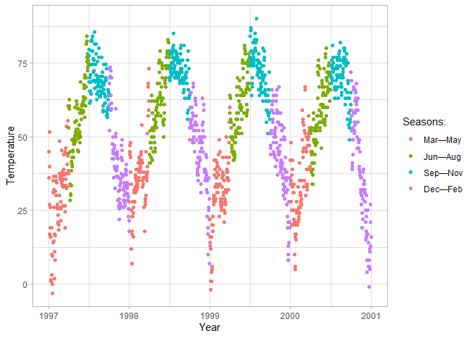
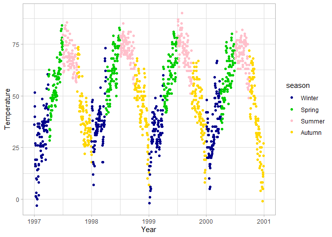
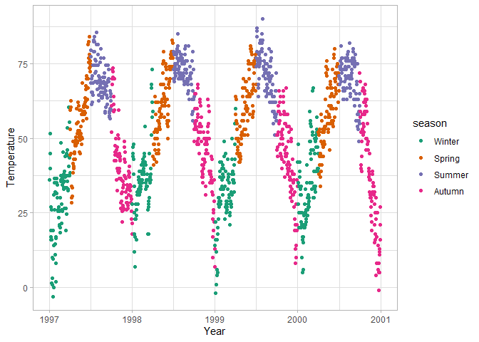
For any aesthetic you specify, you can override the default behavior by
adding scale_... elements. You can manually specify legend titles,
color palettes, labels, etc.
ggplot(chic, aes(x = date, y = temp, color = season)) +
  geom_point() +
  labs(x = "Year", y = "Temperature") +
  # Specify the title and legend labels of the color scale
  scale_color_discrete(
    name = "Seasons:",
    labels = c("Mar—May", "Jun—Aug", "Sep—Nov", "Dec—Feb")
  )
ggplot(chic, aes(x = date, y = temp, color = season)) +
  geom_point() +
  labs(x = "Year", y = "Temperature") +
  # Manually specify the colors per season
  scale_color_manual(values = c("darkblue", "green3", "pink", "gold"))
ggplot(chic, aes(x = date, y = temp, color = season)) +
  geom_point() +
  labs(x = "Year", y = "Temperature") +
  # Use a predefined color palette from RColorBrewer
  scale_colour_brewer(type = "qual", palette = 2)
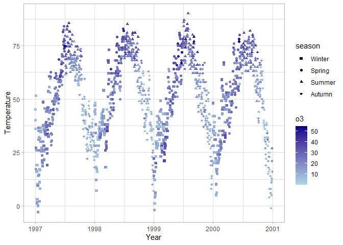
ggplot(chic, aes(x = date, y = temp, color = o3, shape = season)) +
  geom_point() +
  labs(x = "Year", y = "Temperature") +
  # Use a gradient color palette specifying the endpoints
  scale_color_gradient(low = "lightblue", high = "darkblue") +
  # Manually specify the shapes per season
  scale_shape_manual(values = c(15, 16, 17, 18))
Coordinate systems
Similarly to scales, you can adjust the default behavior of the x and y
axes as well (e.g. specify different axis limits, breaks, or labels),
either by the scale_x_...()/scale_y_...() arguments or by changing the
coordinate system with coord_...().
scale_x_...()/scale_y_...() is most useful for changing the axis
breaks and labels, while coord_...() can e.g. flip the axes, adjust
the aspect ratio (see coord_fixed()), and determine whether
observations beyond the plot boundaries should be displayed.
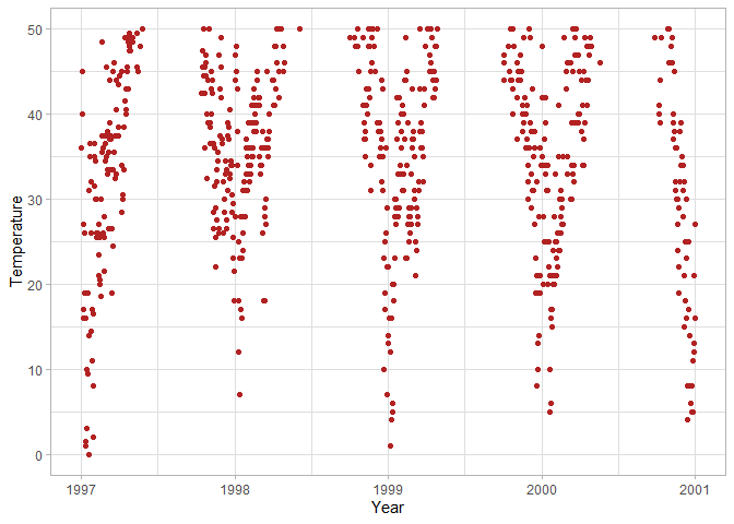
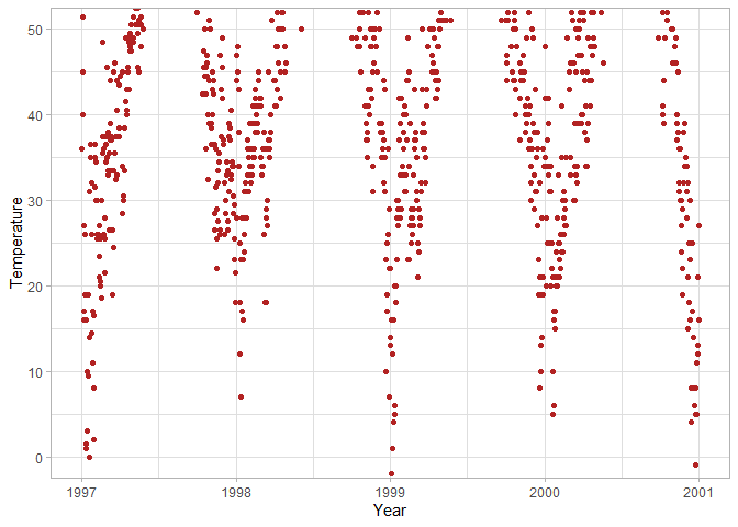
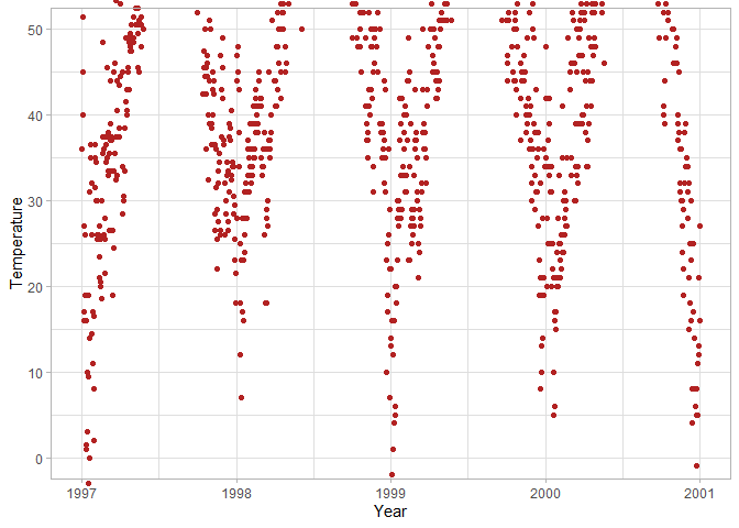
Both scale and coord can adjust axis limits, with a subtle
difference in their behavior.
ggplot(chic, aes(x = date, y = temp)) +
  geom_point(color = "firebrick") +
  labs(x = "Year", y = "Temperature") +
  # Only plot observations with temp between 0-50
  scale_y_continuous(limits = c(0, 50))
ggplot(chic, aes(x = date, y = temp)) +
  geom_point(color = "firebrick") +
  labs(x = "Year", y = "Temperature") +
  # Limit the y-axis between 0 and 50, but don't filter out points
  coord_cartesian(y = c(0, 50))
ggplot(chic, aes(x = date, y = temp)) +
  geom_point(color = "firebrick") +
  labs(x = "Year", y = "Temperature") +
  # Limit the y-axis between 0 and 50, and let points show beyond the plot panel up to the plot margins
  coord_cartesian(y = c(0, 50), clip = "off")
ggplot(chic, aes(x = date, y = temp)) +
  geom_point(color = "firebrick") +
  labs(x = "Year", y = "Temperature") +
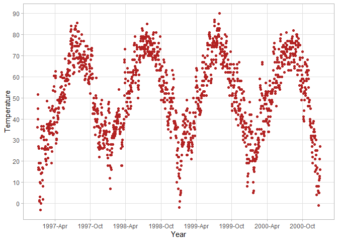
  # Customize y-axis breaks to be 0, 10, 20, ... 90
  scale_y_continuous(breaks = seq(0, 90, 10), minor_breaks = NULL) +
  # Customize x-axis breaks to be every 6 months in the format of year-month
  scale_x_date(date_breaks = "6 months", date_labels = "%Y-%b", minor_breaks = NULL)
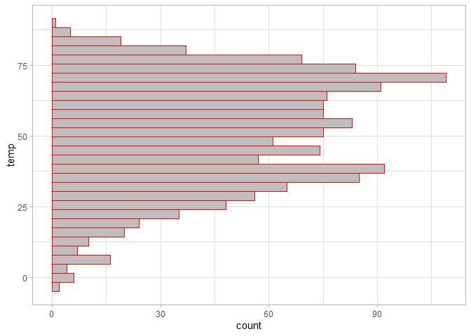
ggplot(chic, aes(temp)) +
  geom_histogram(fill = "grey", color = "red") +
  # Flip the x and y axes
  coord_flip()
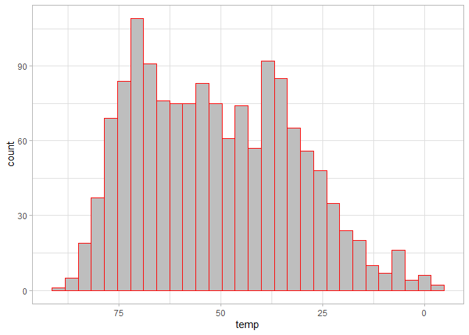
ggplot(chic, aes(temp)) +
  geom_histogram(fill = "grey", color = "red") +
  # Reverse the x axis
  scale_x_reverse()
Multiple plots
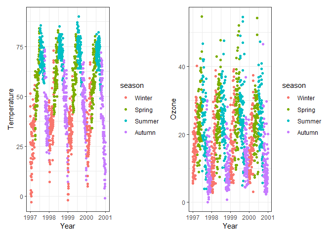
Often you would like to present multiple plots side-by-side: maybe show how the relationship between variables differs depending on some groupings of observations (and putting all observations on a single plot looks too cluttered), or compare how different outcome variables react to changes in an explanatory variable. The two main ways to nicely arrange plots are
- creating a single plot with multiple panels, known as facets;
- creating multiple independent plots, and arranging them into one figure afterwards.
Using facets
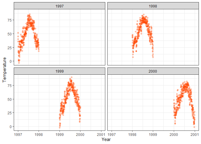
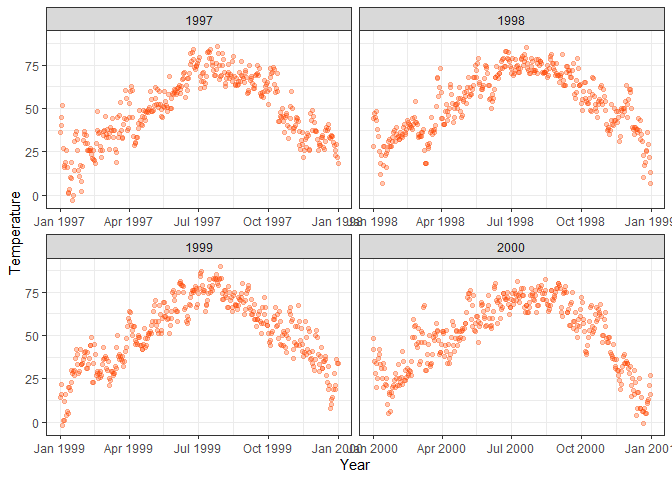
By specifying a grouping variable along which to facet, you can create a
separate plot for each value of your facet variable. You can create
faceted plots by adding facet_wrap() to your ggplot object, and
specify the faceting variable with a tilde (~). You can also specify
additional arguments such as whether to allow the axis limits to vary
between panels. Only use variables with relatively few unique values as
your facet dimension, otherwise R will attempt to create far too many
plots, which takes a long time and might even crash your R session.
# Change the default theme to bw
theme_set(theme_bw())

ggplot(chic, aes(x = date, y = temp)) +
  geom_point(color = "orangered", alpha = .3) +
  labs(x = "Year", y = "Temperature") +
  # Create separate plots per year
  facet_wrap(~year)
ggplot(chic, aes(x = date, y = temp)) +
  geom_point(color = "orangered", alpha = .3) +
  labs(x = "Year", y = "Temperature") +
  # Create separate plots per year and allow different x-axes per plot
  facet_wrap(~year, scales = "free_x")
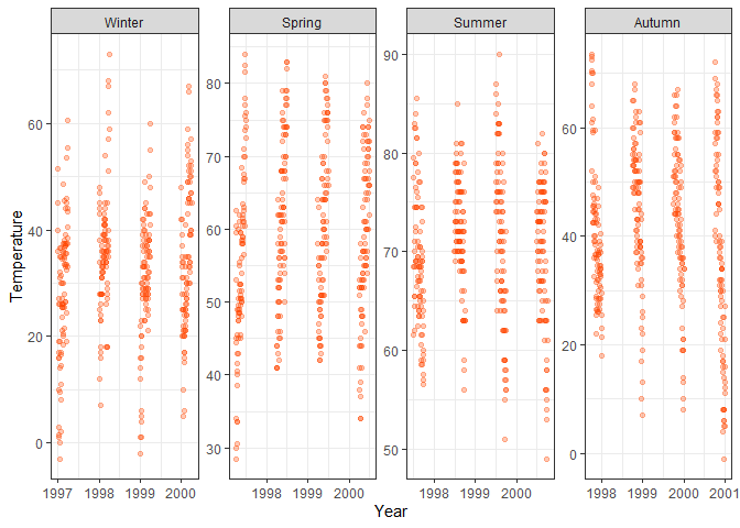
ggplot(chic, aes(x = date, y = temp)) +
  geom_point(color = "orangered", alpha = .3) +
  labs(x = "Year", y = "Temperature") +
  # Create separate plots per season, arrange all plots in one row, let all scales vary
  facet_wrap(~season, nrow = 1, scales = "free")
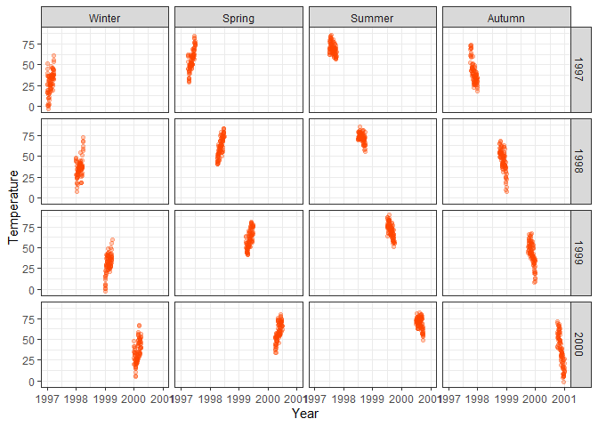
If you would like to group your data based on two variables, you can use
facet_grid(), separating your two variables with a tilde. However,
note that axis limit customization options are more limited with
facet_grid(), so if you need your axes to vary within columns/rows as
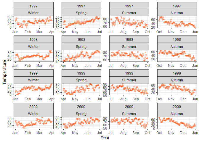
well, you can use facet_wrap() with the same two-variable argument as
well. However, with facet_wrap() your faceting variables are “stuck”
together, which makes the overview of which dimension corresponds to
changes in whcih faceting variable less clear.
ggplot(chic, aes(x = date, y = temp)) +
  geom_point(color = "orangered", alpha = .3) +
  labs(x = "Year", y = "Temperature") +
  # Arrange plots vertically per year and horizontally per season with facet_grid
  facet_grid(year~season)
ggplot(chic, aes(x = date, y = temp)) +
  geom_point(color = "orangered", alpha = .3) +
  labs(x = "Year", y = "Temperature") +
  # Same but with facet_wrap
  facet_wrap(year~season, scales = "free")
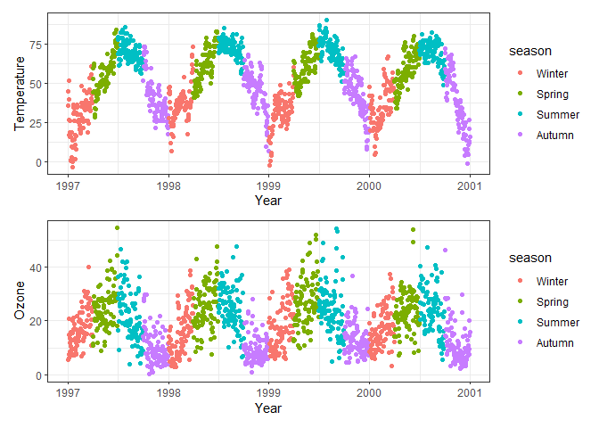
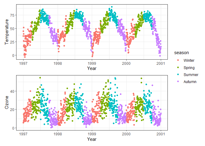
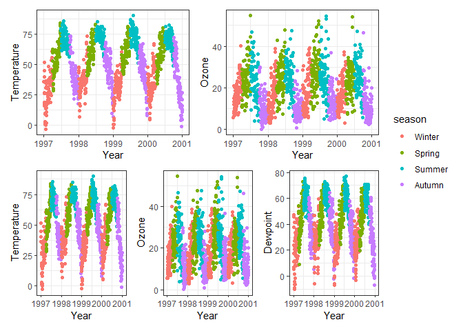
Combining independent plots with patchwork
In order to nicely arrange separate plots and same them as a single
file, you can use the patchwork packages. First you need to save each
of your plots into an R object (here p1, p2, p3), then use +
signs to combine the plots horizontally, and / signs to combine them
vertically. You can make these layouts as complex as you want to by
using parentheses to group rows. Alternatively, you can specify custom
layout options, including additional options such as whether to repeat
or collect legends, by adding a plot_layout() function to the plot
objects.
# Create and save plots of temp, ozone level and dewpoint over time

p1 <- ggplot(chic, aes(x = date, y = temp, color = season)) +
  geom_point() +
  labs(x = "Year", y = "Temperature")

p2 <- ggplot(chic, aes(x = date, y = o3, color = season)) +
  geom_point() +
  labs(x = "Year", y = "Ozone")

p3 <- ggplot(chic, aes(x = date, y = dewpoint, color = season)) +
  geom_point() +
  labs(x = "Year", y = "Dewpoint")

# Combine temp and ozone horizontally
p1 + p2
# Combine temp and ozone vertically
p1 / p2
# Combine temp and ozone vertically with plot_layout, do not repeat legends
p1 + p2 + plot_layout(ncol = 1, guides = "collect")
# Arrange p1 and p2 horizontally on top, p1, p2 and p3 horizontally below
(p1 + p2) / (p1 + p2 + p3) + plot_layout(guides = "collect")
Often it is possible to achieve your desired plot layout both by
faceting or with patchwork, but depending on your goal and the
structure of your data, one approach may be easier than the other. A
good rule to keep in mind is that faceting wants data in long format,
while patchwork often wants wide format: faceting needs a grouping
variable that for each observation defines which facet it should go on,
while in patchwork you can change the aesthetics between plots, so you
can easily switch which variables to use per plot.
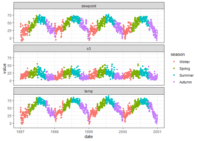
The following example shows how we can create the same plots with
faceting as with patchwork by converting the data to long format where
the name variable specifies whether the value is the value of
temperature, ozone, or dewpoint.
# Side-by-side plots of temperature, ozone and dewpoint with facet_wrap
chic |>
  # Convert data to long format with variable names to "name" and values to "value"
  pivot_longer(c(temp, o3, dewpoint)) |>
  ggplot(aes(date, value, color = season)) +
  geom_point() +
  # Facet by variable name, arrange in one column
  facet_wrap(~name, ncol = 1)
Customizing plot elements
So far we modified the default theme (aka theme_grey()) by specifying
alternative predefined themes (e.g. theme_light()). A way to customize
plot elements even further is to change the theme() function by
redefining particular plot elements.
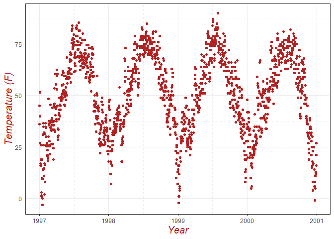
Every design element of a plot (panel, grid, axes, text, legend keys,
etc.) can be changed with an element_...() function
(e.g. element_text() for text, element_line() for lines,
element_blank() if the element shouldn’t be displayed). Each element
type has different characteristics you can customize; a few examples are
shown here. The help file of the theme() functions describes the
options in detail.
ggplot(chic, aes(x = date, y = temp)) +
  geom_point(color = "firebrick") +
  labs(x = "Year", y = "Temperature (F)") +
  # Customize axis title fonts
  theme(axis.title = element_text(size = 15, color = "firebrick", face = "italic"),
        # Remove y-axis ticks
        axis.ticks.y = element_blank(),
        # Change minor grid to dashed lines
        panel.grid.minor = element_line(linetype = "dashed"))
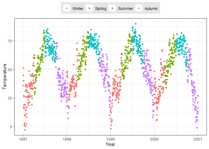
ggplot(chic, aes(x = date, y = temp, color = season)) +
  geom_point() +
  labs(x = "Year", y = "Temperature", color = "Season") +
  # Move legend to above the plot
  theme(legend.position = "top",
        # Change legend background color
        legend.background = element_rect(fill = "grey90"),
        # Remove legend title
        legend.title = element_blank())
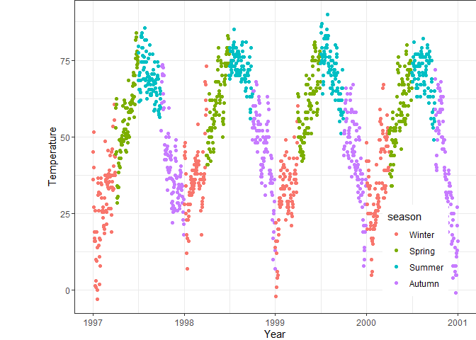
ggplot(chic, aes(x = date, y = temp, color = season)) +
  geom_point() +
  labs(x = "Year", y = "Temperature") +
  # Move legend to coordinates within the plot
  theme(legend.position = c(0.85, 0.2),
        # Add whitespace to the left side of the plot
        plot.margin = margin(l = 50))
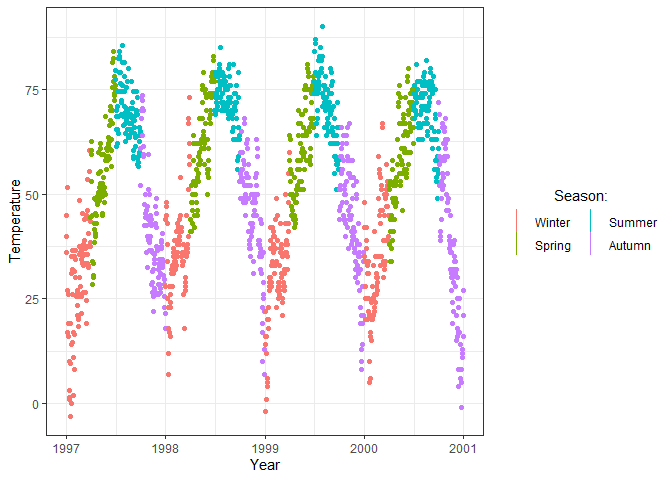
In addition to the theme() function there are also other ways to
customize legends. You can change what key shape to use by specifying
the key_glyph within a geom (for the available options of shapes, see
here). You can
also add a guides() function to your ggplot object: some options
there overlap with options in theme(), but there are also additional
arguments such as arranging legend items in multiple rows/columns or
specifying the order of legends if there are multiple.
ggplot(chic, aes(x = date, y = temp, color = season)) +
  geom_point(key_glyph = "vline") +
  labs(x = "Year", y = "Temperature") +
  # Customize the legend further with guide_legend()
  guides(color = guide_legend("Season:", title.hjust = 0.5, nrow = 2))
Saving plots
You can save ggplot objects to use outside of the R environment with
the ggsave function. You can specify an existing ggplot object as
the first argument, but by default ggsave() saves the last plot
displayed in your Plots panel. You always need to specify the file path
of the saved plot, including the preferred file format (e.g. .png, .jpg,
.pdf). You can adjust the plot size with the scale argument or by
specifying the height and width in your preferred units (the default
units are inches).
ggplot(chic, aes(x = date, y = temp)) +
  geom_point()

# Save last plot
ggsave("figures/plot1.png", scale = 1.5)

p <- ggplot(chic, aes(x = date, y = temp)) +
  geom_point()

# Save plot saved to the Environment
ggsave(p, "figures/plot2.png", height = 10, width = 15, units = "cm")
Other plotting packages and plot types
While ggplot is extremely flexible and therefore sufficient for most
of your plotting needs, it is good to be aware of how to use a few other
packages developed for more specific purposes.
Correlation scatterplot matrix with GGally
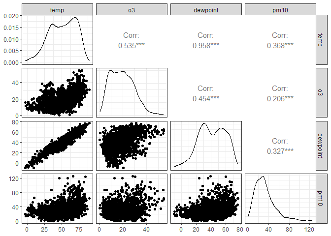
To estimate the relationships between a set of (continuous) variables in
a dataset, you’d usually calculate a correlation matrix. The ggpairs()
function from the GGally packages presents both this correlation
matrix, and plots the distribution of each variable and the
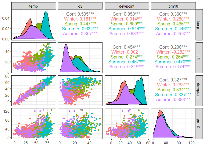
relationships for each variable pair. You can adjust the default
function e.g. by specifying an additional grouping variable; for more
options, see the examples in Modern Data Visualization with
R.
chic |>
  # Keep only 4 continuous variables
  select(temp, o3, dewpoint, pm10) |>
  # Create correlation matrix of the selected variables
  ggpairs()
chic |>
  # Keep 4 continuous variables and season as the grouping variable
  select(temp, o3, dewpoint, pm10, season) |>
  # Recreate the previous plot but group observations by season
  # Use only the first 4 columns for the plots (exclude season)
  ggpairs(columns = 1:4, ggplot2::aes(color = season))
Pie chart
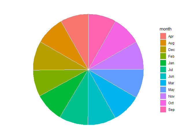
While data scientists do not recommend using pie charts (because humans
are quite bad at comparing areas, and better at comparing lengths such
as on bar charts), you can nevertheless create pie charts in ggplot.
In order to do so, you need to create a bar chart, and change the
coordinate system to polar coordinates. To make the bars look nice, you
should specify your aesthetics and geoms similarly to the example below.
chic |>
  # Get the number of observations per month
  count(month) |>
  # Specify y as the counts and fill as the categorical variable
  ggplot(aes(x = "", y = n, fill = month)) +
  # Create bars with white borders
  geom_bar(stat = "identity", width = 1, color = "white") +
  # Change coordinate system to polar coordinates instead of Cartesian
  coord_polar("y", start = 0) +
  # Remove background theme elements
  theme_void()
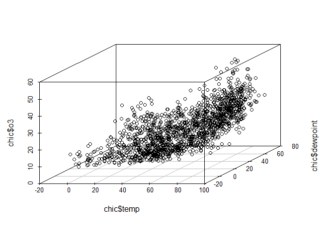
3-D scatterplot
Similarly to pie charts, 3-D plots are also discouraged because they are
hard to interpret, so use them only if absolutely necessary. In that
case, the scatterplot3d package contains the scatterplot3d()
function where you need to specify the variables to put on each axis.
Note that this function does not have a separate data argument, so you
need to specify the variables by extracting the column from the
dataframe with the $ operator.
# Create a 3-D scatterplot of temperature, dewpoint and ozone levels
scatterplot3d(x = chic$temp,
              y = chic$dewpoint,
              z = chic$o3)
Alluvial/Sankey diagrams with ggalluvial and networkD3
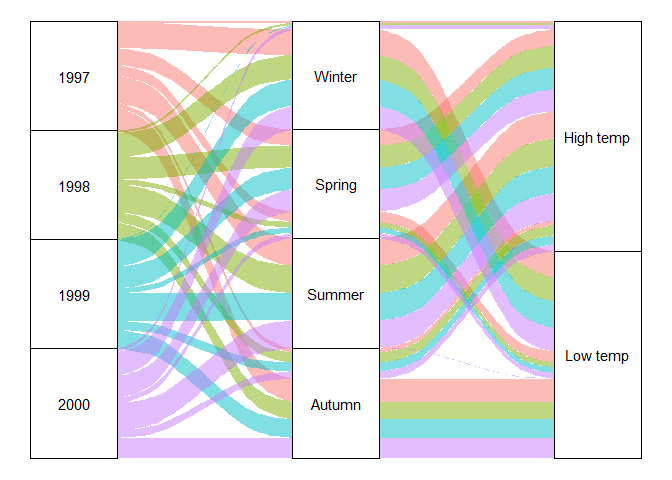
An interesting plot type is an alluvial diagram, also known as a Sankey diagram. It shows flows between different categories, and is frequently used e.g. to show changes over time in the share of observations belonging to particular groups (e.g. what energy sources households use in 1950 versus in 2000). For demonstration purposes, we’ll instead look at how observations per different seasons are split between high and low temperatures (e.g. expecting to see mostly low temperatures in Winter).
In order to create a static alluvial diagram, you can use the
ggalluvial package and standard ggplot workflows with alluvium and
stratum geoms.
chic |>
  # Redefine temperature as a categorical variable: above mean temperature is high, below is low
  mutate(temp = ifelse(temp > mean(temp), "High temp", "Low temp")) |>
  # Get number of observations per year, season, temp category
  count(year, season, temp) |>
  # axis1, axis2, axis3 are the categorical grouping variables, y is the number of observations per group
  ggplot(aes(axis1 = year, axis2 = season, axis3 = temp, y = n)) +
  # Create flows, with colors per year
  geom_alluvium(aes(fill = factor(year))) +
  # Add rectangles for the categories of each variable
  geom_stratum() +
  # Label the rectangles
  geom_text(stat = "stratum",
            aes(label = after_stat(stratum))) +
  # Remove background plot elements and legend
  theme_void() +
  theme(legend.position = "none")
For an interactive version of the previous plot, you can use the
networkD3 package, however, note that this package requires the input
data to have quite a specific format. You need a dataframe of the widths
(frequencies/shares) of each link, specifying a numeric identifier for
the source and target nodes. In addition, you need a dataframe of nodes
that matches the numeric IDs to node names. Once you have both of these
dataframes, you can use the sankeyNetwork() function. Note that
creating the input dataframes gets significantly more complex if the
diagram has more than two levels.
(Interactive plots do not display properly on the website.)
# Create a tibble of links with 3 variables: source, target, number of observations
links <- chic |>
  # Redefine temp to hig/low categorical
  mutate(temp = ifelse(temp > mean(temp), "High temp", "Low temp")) |>
  # Number of observations per season-temperature combination
  count(season, temp)

# Create a tibble of nodes by listing the unique categories in the links tibble
nodes <- tibble(name = unique(c(links$season, links$temp)))

# Add numerical identifiers of the nodes to the links tibble by using the row index in the nodes tibble
# Subtract 1 to start the count at 0
links$IDseason <- match(links$season, nodes$name)-1
links$IDtemp <- match(links$temp, nodes$name)-1

# Create an interactive Sankey diagram from the links and nodes tibbles, the numerical category IDs, the observation counts per link and the variable name of the nodes tibble
sankeyNetwork(Links = links, Nodes = nodes, Source = "IDseason",
              Target = "IDtemp", Value = "n", NodeID = "name")
Interactive charts with plotly
If you work with interactive documents, you might want to make your
plots interactive as well, e.g. by highlighting the data points that a
user hovers over. It is very easy to turn ggplot objects into
interactive plots with the plotly package: just save the ggplot to
an object, and use that object as the argument of the ggplotly()
function.
(Interactive plots do not display properly on the website.)
# Define a simple plot and assign to an object
p <- ggplot(chic, aes(x = date, y = temp, color = season)) +
  geom_point() +
  labs(x = "Year", y = "Temperature")

# Display the plot as an interactive plot
ggplotly(p)